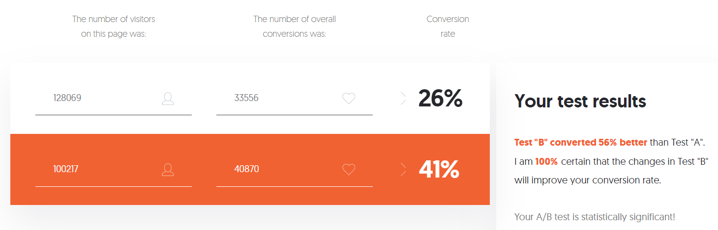
At the beginning of 2022, I was challenged to increase the application conversion rate for a fintech company. The conversion was already decent at 26%. However, we wanted to be the best in class. So how do you improve the conversion rate on something already performing well?
As a product manager and marketing consultant, that was the first question I asked my team. Although you could surmise some logical answers, it was more of a rhetorical question.
The correct answer was through extensive research, user testing, and experimentation.
The first thing we did was comb through our existing flow to see where users were dropping off or encountering friction.
After mapping out the next journey, we looked at the data and examined if different cohorts of customers responded differently.
We found three primary cohorts: returning, new, and affiliate users.
Utilizing tools like full story, Google analytics, Optimezly, survey monkey, and identity resolutions solutions, we were able to carve out the various persona types and their issues.
Looking at metrics like page scroll depth, form field abandonment, customer feedback, rage clicks, and page load speed time, we found elements that could move the needle.
Once we knew the most common issues, we did competitive research and incorporated psychological principles and best practices to redesign the flow.
If we could lower friction, boost clarity, and reduce page load speed, that should improve the conversion rate.
By combining user-driven research, design thinking, and tried and tested theories like the goal gradient, it would be likely we could significantly lift the conversion rates, and we did.
After a competitive analysis using the LIFT model on various websites, we found the strengths and weaknesses of our funnel vs. our competitor’s funnels, giving us areas of improvement and a series of testable hypotheses.
That allowed us to develop design solutions to start testing for validation.
It was clear to us we were trying to get customers to complete too much information on one page, and the current design was not optimized for mobile, where 80% of the traffic comes from.
This was a considerable pitfall in the user experience and an opportunity for significant improvements.
So, we tested a multi-step funnel vs. the standard one-page form optimized for mobile devices. However, the design was responsive on all screen sizes.
After testing, it was apparent that breaking the steps into small digesting parts made the task feel like it took less effort.
We also decided to let users see their progress as they completed the application so they could see that they were almost done once they reached a particular step in the funnel.
In addition, we redesigned fields with the most drop-off due to lack of clarity and tested different UI layouts and copy to make them more user-friendly.
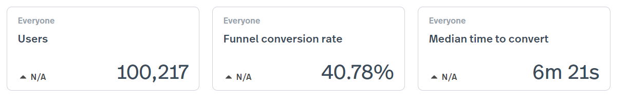
Through iterative research, design, and testing, we produced a new flow that increased the application conversion rate by 56%, lifting our conversion rate to 40.78%, making us the best in class.
This was one of the essential financial contributions to the company that year, unlocking many new opportunities for people who may have abandoned our application process before.
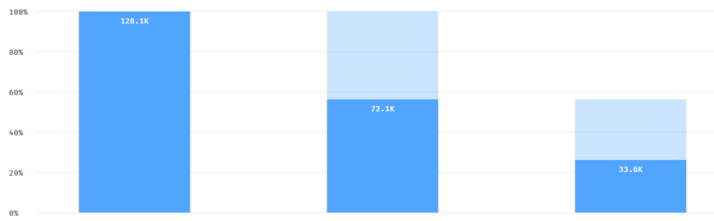
Old funnel

New funnel
Results
The moral is that no matter how complicated the problem is, if you have a solid framework to find issues and fix them, you can create incremental improvements that lead to big wins.